Why Calcite Components?
Esri’s Calcite Components is a library of web components that provides commonly used UI elements that you can use to compose a modern, professional-looking user interface. If you are using React, Calcite Components become even more composable with the Calcite Components React target build. Utilizing the React build of Calcite Components also provides a solution to cleanly apply a theme to the resulting React components to convey your company’s branding or adhere to a custom theme.
Example App Setup
For this example we will use the npx script Create React App to quickly get a react app up and running. In a terminal, run:
$ npx create-react-app themed-calcite-components
$ cd themed-calcite-components
$ npm start
After the application has started in a browser tab, any changes we make to the code will reload the app automatically in the browser. To install the react build of Calcite Components run:
$ npm install –save @esri/calcite-components-react
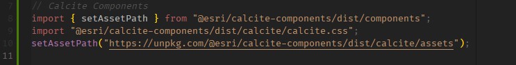
After the package is done installing we can follow the installation instructions and update index.js with these lines:
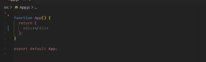
… and update App.js, removing the automatically generated Create React App-specific lines, to give us a clean App component to work with:
Extending Calcite Components with Styled Components
At this point we could begin importing standard React built Calcite Components and compose a UI, but we want to compose our app with extended Calcite Components that respect a theme. To implement this we need one more package called Styled Components.
To install Styled Components run:
$ npm install –save styled-components
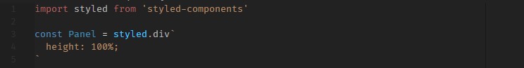
Styled Components lets you extend html elements and return React components.
You can also extend other React components like our React built Calcite Components.
To do so, create a new file in the src/ folder called ThemedCalciteComponents.js. In that new file import Styled Components like the above example and add the following lines:
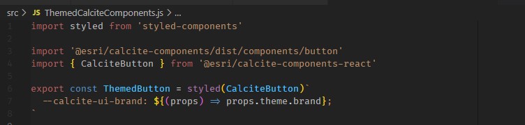
In this file we are importing the styled components package, the standard CalciteButton component from Calcite Components React and then we are creating a custom CalciteButton called ThemedButton that overwrites any –calcite-ui-brand css variable with a brand value passed into its theme prop. The returned React component is then being exported to be imported somewhere else in our app to compose the UI.
Let’s open App.js and import our new custom CalciteButton:
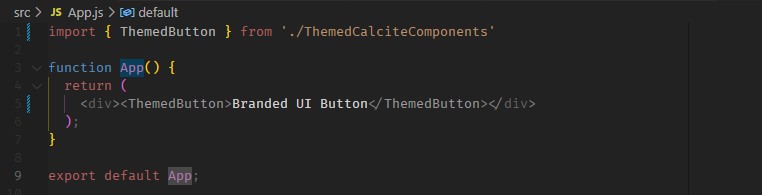
If you take a look at the reloaded app in the browser you can see that our custom button looks and behaves just like a standard Calcite Button. It is still the default Esri blue because we have not yet created a custom theme to be passed down to the React elements below it.

To do that we use the ThemeProvider component from Styled Components:
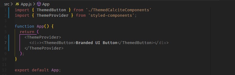
Here we are importing the ThemeProvider component and wrapping the entire app component with it. If a theme prop is provided to a ThemeProvider, any React components under the ThemeProvider in the dom tree will get that theme object passed into it which can be leveraged in our ThemedCalciteComponents.js file. Let’s create a custom theme object and pass it into the ThemeProvider:
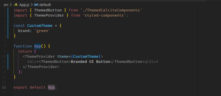
The reloaded app should show a CalciteButton respecting our new branding with green as the primary color:

Branding and theming are just a couple of the many ways that Calcite Components can be extended by Styled Components to custom tailor Calcite Components to your desired user interface. Recommended next steps would be to review the Styled Components documentation and explore other useful ways to extend Calcite Components. If you need a place to start the above code can be accessed here.
Need help with branding your applications? We can help! Contact us at connect@geo-jobe.com