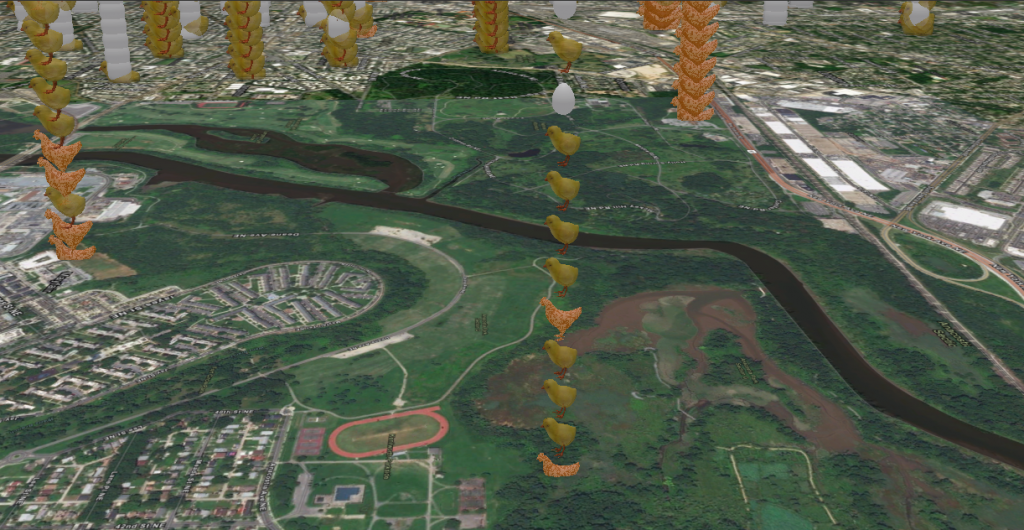
Finding the correct balance of logic and appeal with data is often a struggle. Data can be bland, confusing, full of acronyms and numbers unknown to users. Finding a way to make this accurately representational with the WOW factor can be a challenge. The more complex the data becomes, the more difficult it can be to visualize. In this article, we’ll explore some helpful tips, industry preferences, and unique insights that might just ease the work of a future project.
Data Preparation
Cleaning, organizing, and preparing the data beforehand can be lengthy, but it will ultimately be deeply rewarding and time-saving for the future. ArcGIS® Pro offers multiple data manipulation tools, including the Data Management extension for off-the-shelf cleaning and organization with ease; Spatial Analyst tools, such as data interpolation methods; APIs for filling or removing missing data; and restructuring methods. A personal favorite of mine is ArcGIS® Notebooks. It gives the familiar feel of Jupyter Notebooks, but works in ArcGIS Pro – accompanied with data science-favored libraries such as Pandas, and the interaction of feature layers with the ArcGIS® API for Python. This allows for a full-control, hands-on feeling of your data.
Plan Ahead!
There are several ways to develop a structured time step and organize your data based on its schema.
- Manually aggregate / alter the timestamp to reflect a more general datetime through notebooks or table properties
- Alter the Layer Properties’ Time tab for a layer to reflect the desired range
- For 2D, in the Time tab of the Ribbon, set the span and interval to iterate in desired timesteps.
Plan your color scheme ahead of time as well. Your organization may have a specific color theme you’d like to tie into your map, or perhaps a specific way of visualizing a desired dataset. Saving these colors into a schema for reuse (without manually adjusting each layer) will save time and effort.
2D / 3D
The visual aspect of data presentation is very much an art in itself. In many uses and custom applications through ArcGIS, time-enabled data is a foundation. On a mapping application, your features will split into two primary groupings of persistent data and temporal data. Persistent data exists in the application despite changes in time, such as unchanging structures, basemaps, shadowboxing effects, and more. Temporal data is any of the feature layers that will be seen changing.
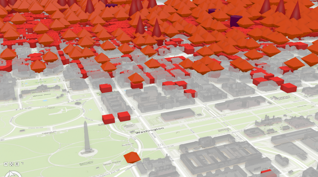
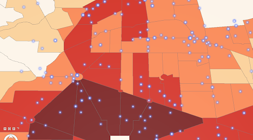
Most data in 2D or 3D will be viewed as point, line, or polygon feature layers. Iterating over these with the time slider will provide the user with control and confidence over changes. Point data should reflect the zoom layer, scale, and aggregate into bins of related size accordingly; while any polygon or line layers should have a contrasting color, or the same color with contrasting brightness. This allows related items to be distinguishable and trends to be seen clearly.
Once you have your data organized by space and time in feature layers, images of the map can be utilized for stills, GIFs, and even videos can be created with the Animation properties.
But what happens when you want to display trends and see them in both space and time simultaneously?
4D
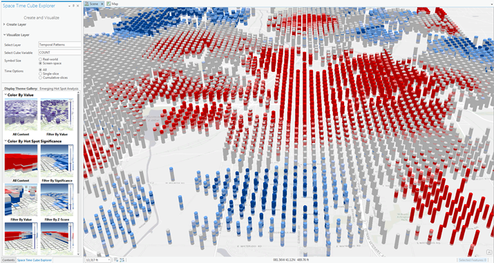
A time slider allows users to see trends in spatial and temporal trends at the same time, but it requires a lot of back-and-forth analysis and clicking that is time-consuming at best and ultimately confusing and unrevealing at worst. Instead, consider this – ArcGIS has a spatiotemporal method of viewing data known as Space Time Cubes. Space Time Cubes, or STC, allow the data to be displayed by X/Y location, time, and degree of a respective attribute field. In ArcGIS Pro, these can be created by either aggregating points, from defined locations, or from a multidimensional raster layer. This is where data preparation, a controlled schema, and organization pay off. Once created, these STCs can be visualized in Pro in 2D or 3D. We’ll focus on 3D in this.
When creating the STC, be sure to include any possible Summary Fields that will be analyzed. These are the fields that the user should be able to see trends in a given feature, represented by numeric values, such as counts or percentages. For example, population at a location, population as a percentage of the focus area at a location, or population normalized to the size of a polygon area at a location.
Once created, this STC allows for a plethora of visualization and space-time data mining. Opening the symbology on a visualization layer allows extreme customization of data ranges, colors and shading, normalization, and even custom layer imagery. If desired, one could set the layers to show different 3D shapes instead of cubes, such as a 10-point emoji pain scale. Heat maps and high contrast colors easily allow the user to see spatiotemporal hotspots.
Space Time Cubes in ArcGIS Pro are a premier way of visualizing 3D and 4D data, allowing high customization to really excite the stakeholders and users. There are advanced benefits to STCs as well, such as forecasting and pattern analysis tools. For more information on those, visit the tool reference. For an example of some unique ways of visualizing 2D and 3D data, check out this the video below from GEO Jobe GIS Consulting, which includes 2D, 3D, and 4D STC.


