


While working with the Esri ArcGIS suite of products, you may have heard of or used Arcade expressions. Arcade was created by Esri due to a need for a language that would be considered simple, portable, secure, and geospatial first. ESRI introduced Arcade in 2016 and has continued to build on it ever since. We have even released two blog posts previously on learning and utilizing Arcade, Enhance Your Web Maps with Arcade and Take Arcade for a Test Drive.
Arcade allows you to customize how your data is displayed, perform mathematical calculations, evaluate logical statements, and much more. Unlike other languages, Arcade wasn’t designed for writing standalone scripts. It was created to enhance your data, maps, and applications while being easy to use. One of the ArcGIS applications I will be reviewing today is ArcGIS Dashboards and some of the useful ways you can use arcade expressions within the application.
Arcade Expressions in ArcGIS Dashboards
ArcGIS Dashboards are used to display your geospatial data, visually show trends, and convey information about your data quickly. You can set up graphs, pie charts, indicators, and monitor your data in real-time to make better decisions that are data-driven. Arcade expressions can help by leveraging your data in a dashboard and extending it so that you have more complex visualization options available. A couple of ways are listed below on how Arcade can enhance your data.
List Element
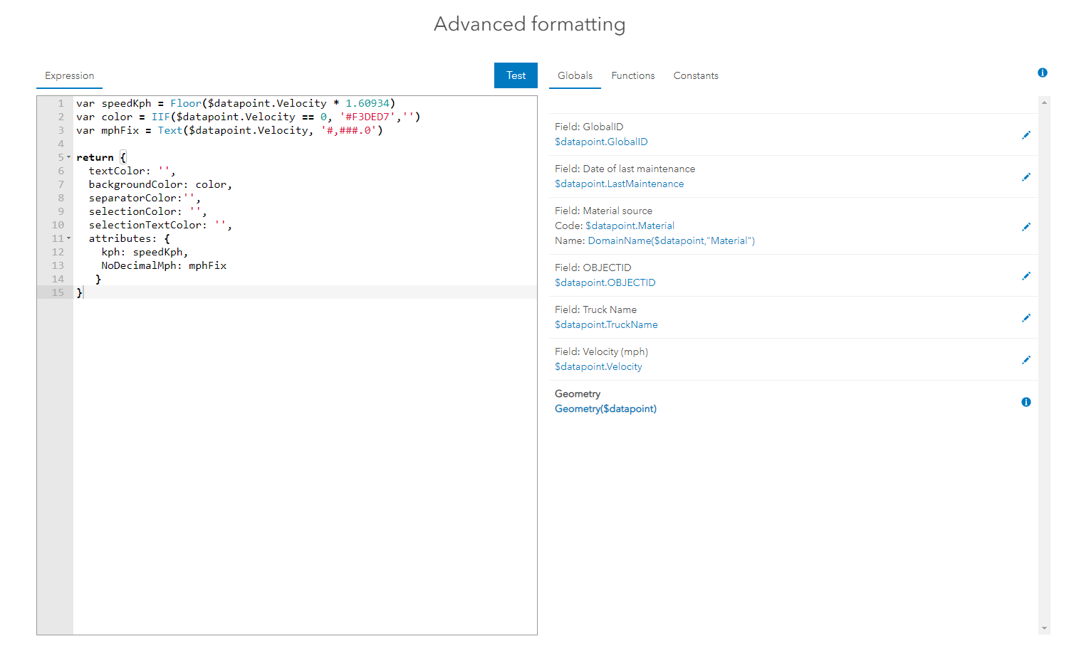
List elements showcase the features or rows from your data by allowing you to show as much or as little as you want about a particular piece of data. If I wanted to see a list in my dashboard of the work orders that were opened or closed, I could use a list to do that. If I, also, wanted to see how long they have been open from the time they were created to now, I could also include that in the list. All of this is possible by creating a calculation in Arcade. In your dashboard,
- Add a new list and select the layer your work orders are in.
- Once selected, you can start customizing how your information will be displayed.
- If you go to the list tab and enable Advanced Formatting, this is where you can write calculations to display your data how you want the end-user to see it.
- You could take this example further by writing a calculation that if the task sits for longer than 48hrs then it will turn red.
- ESRI has a great document on this type of workflow and an example of the arcade expression.
Indicator Element
Indicator elements are similar to the list element in that how you write Arcade expressions is the same. You go to the Indicator tab, enable the Advanced Formatting option, and reference your data when writing expressions. You can create informative indicators that have multiple thresholds, customize the displays, and formulate calculations. This allows your viewers to have an abundance of data at a glance.
For example, if I wanted to set up an indicator that displays all the work orders that are open but when they hit a total of 20 the box turns red. You can do this by using an Arcade expression by setting up thresholds. Again, ESRI has a great document on how to set up your indicator for conditional formatting using Arcade.
ArcGIS Dashboards are a quick way to display data that makes it easy for others to interpret your information. Using Arcade expressions, you can create complex visuals to improve the use of your dashboard. You can also access derived data sources through Arcade in the pop-ups, lists, indicators, and other elements. Above is a presentation from ESRI’s 2021 Developers Summit that goes over Arcade in ArcGIS Dashboards further.
After sitting through presentations and working with Arcade in ArcGIS Dashboards, I have only skimmed the surface of the capabilities and uses. ESRI’s Arcade is a great way to enhance your ArcGIS applications without needing to dig out your developer toolbox. The best way to learn is to just dive in! Check out this training course offered by Esri on Using Arcade Expressions in ArcGIS Dashboards.